5 Ways to Make Your Bathroom Feel Bigger
We’ve remodeled a lot of bathrooms in the Boise, Eagle, Meridian, and Garden City areas in the last 25 years. We love creatively reconfiguring the layout of spaces when that’s what the client desires, but something else we love is maintaining a layout and updating it in a way that makes the entire space feel larger. We recently wrapped up a master bathroom remodel for some awesome clients of ours in Meridian where we kept the same layout but remodeled the space to feel much more open, and the end result turned out beautifully. Although the overall layout remained the same, this bathroom renovation created a feeling of more space and better flow. For this month’s blog, we’re sharing some of the ways we achieved the look and feel of more space while maintaining the same square footage when designing this bathroom remodel.
Paint
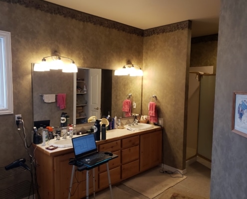
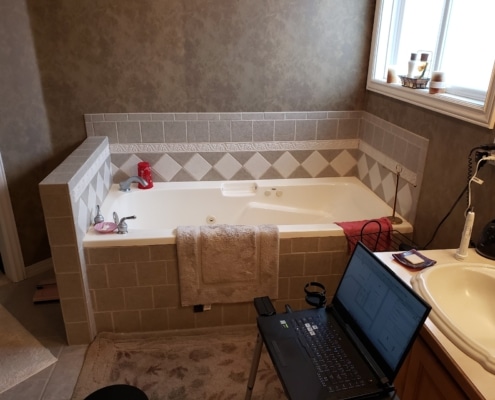
The original 2001 wallpaper of this master bathroom was outdated and too dark for the space, making this bathroom feel closed in and cave like. To lighten up the space and give it a breath of fresh air we tore down the wallpaper, painted the walls Sherwin Williams Light French Gray 0055, and went with Sherwin Williams Frost Bite 9505 for the ceiling. What a difference!
Lighting
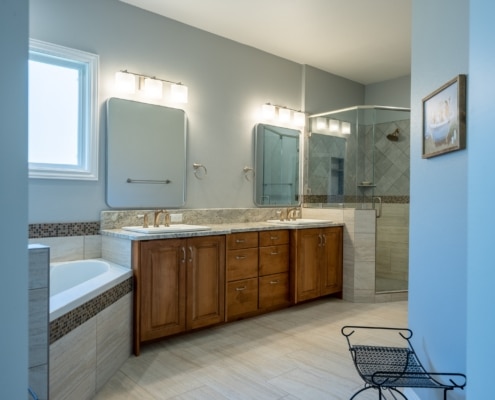
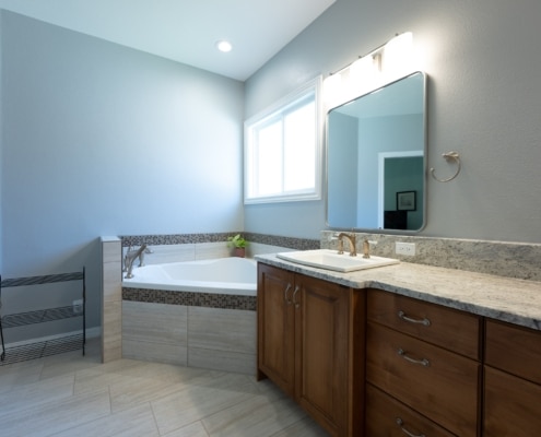
The lighting in the bathroom was a major contributor to making the space feel dim. We replaced the two existing can light trims with new LED retrofit trim and updated the vanity lighting with gorgeous 3 light sconces above each mirror, featuring a brushed nickel finish and frosted oval glass shade. We installed a dimmer for the lights to give the clients even more versatility with their lighting.
Shower Glass
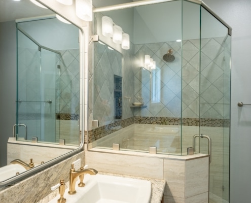
The shower stall hidden behind a wall felt incredibly closed in. We removed the top half of this wall to create a partial pony wall and featured a shower glass enclosure that took the space from small and dark to open and luxurious feeling. The reframe of the shower included a lot of intricate details to give the shower door the perfect pivot point and room it needed.
Storage
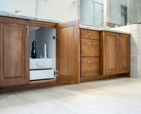
Optimizing storage and organization is always a great way to create a feeling of more space in any bathroom remodel. Most bathroom vanities have unutilized space below the sink which we addressed with custom cabinetry featuring pull out drawers, shelves, and plug ins. The updated design allows for decluttered space and shows off the exquisite granite countertop these clients chose.
Dead Space
The pony wall and placement of the original tub created a lot of dead space and perplexing angles. By removing the pony wall that was jetting out into the room and installing a corner tub that goes flush with the vanity, the traffic flow went from awkward to effortless. The difference significantly transformed the feeling of the bathroom from the moment you walk into the room.

