Project Spotlight: Boise Kitchen Remodel and Second Story Room Addition
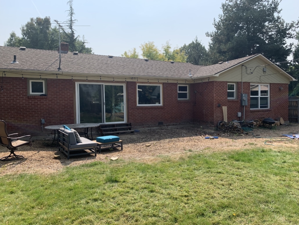
These clients hired us as their Boise home remodeler based on their desire of a better kitchen for their one-story 1953 ranch style home located on the Boise Bench. They needed more space and better functionality! The kitchen, dining room, and living room were all very compartmentalized and closed off from each other. Walls were everywhere in this house and they had a huge fireplace (nicknamed Big Bertha) that was also taking up a lot of unnecessary room. In addition to a kitchen remodel, these fun homeowners who love to dance were dreaming of large room addition where they could have a space for dancing, playing, and working from home.
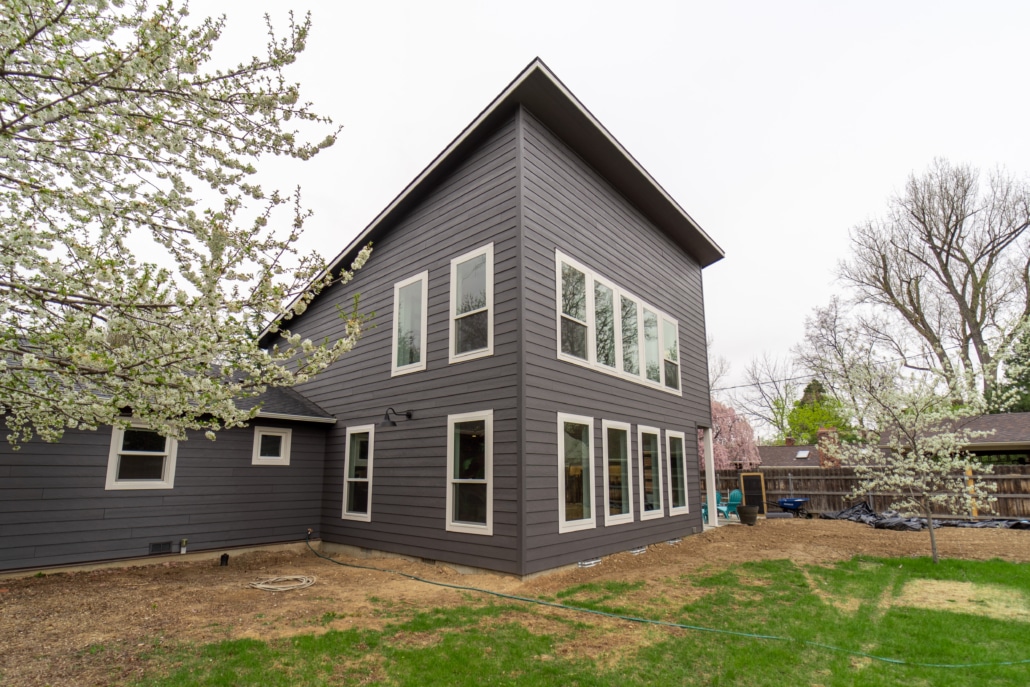
To design an additional room large enough to achieve what these clients wanted to use the space for, the only place to go was up! We added a massive second-story addition to the home and almost tripled the size of the kitchen and dining area with the new layout on the first floor. This Boise home is located on a popular street in an area known for unique, vintage looking homes that have a lot of beauty and character, so complementing the style and era of the existing home and enhancing the overall look of the exterior was a key part of this great design. It was also important for us to bring out the style and personality of the clients which was more modern and eclectic.
The difference in the layout’s functionality, traffic flow, and appearance from the before and after on this home remodel are like night and day. The kitchen features a large island with a stunning granite countertop that has a smooth, polished finish to be able to write on, and the back countertops are a dark leathered surface that the clients loved the look and texture of. The contrasting countertops not only meet the functional needs of the clients, but they also look beautiful together. We love how the countertops, backsplash, and light fixtures all talk to each other. We brough some fun colors into the home and beautiful contrast in materials and textures are seen throughout.
Beyond being gorgeous, the modernistic floating staircase leading to the second story addition was designed to maintain the open layout and was a major highlight of this project. Because the house was initially constructed as a single-story, the placement of the stairs was crucial and required steel columns to secure the roof. It took creativity and thinking outside of the box with the engineering and design to make every element look beautiful and intentional while addressing safety. We wrapped one of the columns with wood and left the other steel column exposed for a modern look that enhanced the overall space and perfectly fits the home and the design wants of the client.
Due to the age of the home, this renovation required some serious craftsmanship and expertise hand cutting a lot of the base and incredible attention to detail with the leveling. Throughout the home there are no lines indicating what’s old and new, everything looks like it has always been there. The exterior alone is a work of art with the angle of the roof on the second story addition being another highlight of this project, and it can even be seen from the front of the home the ways we were able to pull everything together. We loved bringing modern touches to the home while enhancing the original aesthetic. Inside and outside, this home looks amazing and was perfectly renovated for functionality, beauty, and the wants and needs of the client.
Home remodel by Renaissance Remodeling, Design by Tammie Coffey, Project Management by Kent Giese


